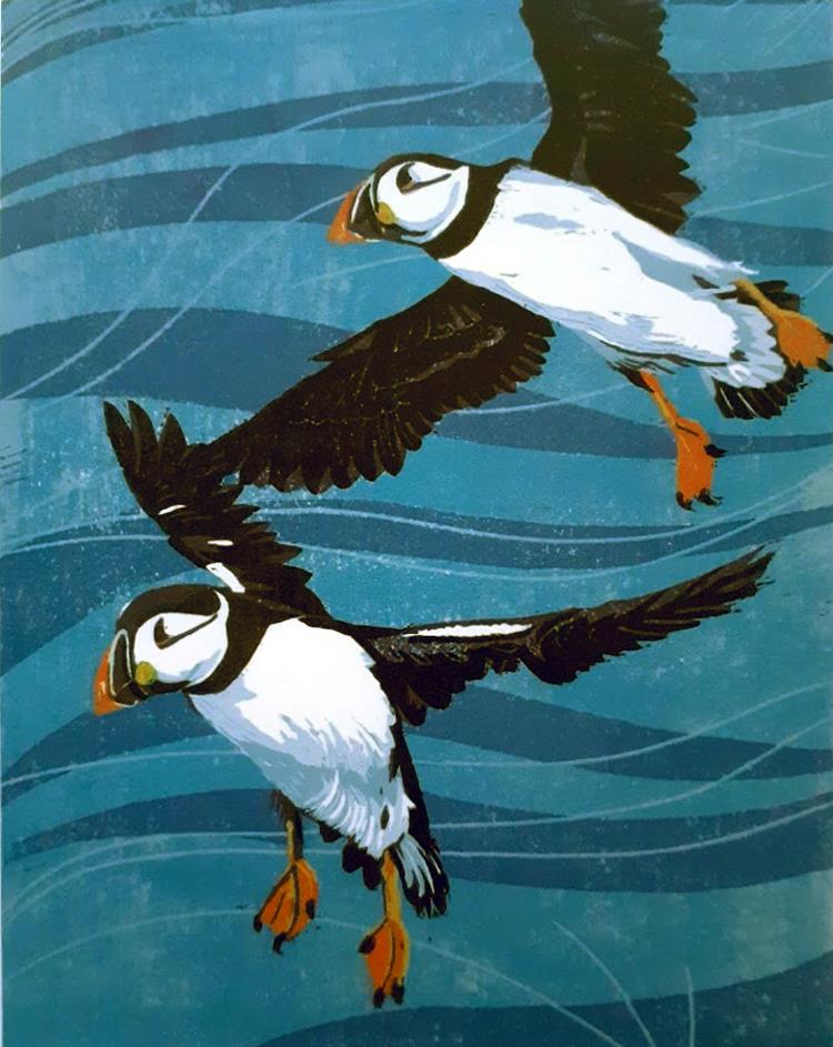
I draw, I sketch and produce mixed-media collages but my absolute passion is for linocutting, and it has been since the mid 1990's. I enjoy the physical process of cutting and carving the lino with freshly honed tools and I find the variety of styles and marks I can achieve with such simple materials always challenging but endlessly surprising and satisfying. You can read more about me and my work here.
NEWS SNIPPETS - December 2025
After a month and a bit away from my lino and my inks, I'm back.
The house move to the Vale of Clwyd is complete and I've been busy producing new cards, mini cards and new tree decorations for this year.
My 2025 Christmas cards (single cards and packs of 3), 'mini' cards and gift tags are available here and a selection of 'one-off' (tree decorations, one-of-a-kind tote bags) can be found here
The planning application for my studio has been approved, so fingers crossed building work will commence soon.
The Bodnant edition completed in June is available on the Botanical page and the other edition 'Llanw isel ar lan y Fenai' (Low tide on the Menai Strait) from the summer is available on the Coast page of my website.
In 'Early Work' you'll find a changing selection of work which I completed more than 10 years ago. An ideal place to browse for affordable linocuts if you're new to buying original art. Earlier in 2025, I printed two versions (one red, one blue) of a new 'Ar lan y mor' edition but it's been hidden away in the 'one-off' works page of the website. As the image is mostly intricate, hand-cut lettering (the first verse of the well know Welsh song), I've just added it to the 'Decorative' page, where is definitely feels more at home.
Reduction linocutting is one of the most complex and intriguing forms of relief printmaking - it requires having to work with a reversed sketch or drawing, being able to envisage multiple layers of tone and colour, all whilst working toward a final image which exists only in my head.
The reduction process involves using a single block of lino which is progressively cut away for each layer of colour. As the block is essentially destroyed during the process, a reduction print can never be reprinted or re-editioned, guaranteeing a genuinely limited edition.
